What is a component state? Let's take a look at buttons - the most basic building blocks on any UI toolkit. Buttons usually have icons and texts so that the users know what will happen when they click them. In addition, modern UI toolkits provide rich texturing capabilities that allow skinning different parts of the button visuals - such as background, border and focus ring. These visuals usually depend on the current state of the button.
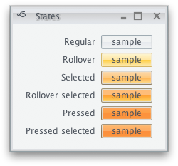
If a button does not respond to UI events (such as mouse click, for instance), it is said to be disabled - and usually has a lighter or partially translucent appearance to match its disabled state. A toggle button can be in a selected state, conveying that certain application parameter is toggled on. A selected button is usually painted with different hue to facilitate quick scanning of the application state. There are more button states - rollover when the mouse is moved over it, pressed when the user pressed but has not yet released the mouse and default button which is invoked when the user presses the Enter key. The following screenshot shows how the same button can look like in different states:
Different controls have different states. For example, a progress bar can be determinate or indeterminate - depending on whether the application code can reliably assess the overall length of the work to be performed. A text component can be editable or uneditable. Input controls can be marked as required - to prevent the user from leaving the screen until he makes a selection on that control.
Component states in Substance are managed by the
org.pushingpixels.substance.api.ComponentState
class. Instances of this class correspond to states of Swing core and custom controls.
This class provides a number of predefined static instances to cover most action-based
controls such as buttons, check boxes and menu items. In addition, application code
can define custom component states that create fine grained mapping between arbitrary
states of controls and specific color scheme bundles in custom skins.
Each component state is defined by two arrays of component state facets (available in
ComponentStateFacet class). The first array specifies the
facets that are on, and the second array specifies the facets that are off. For example,
when a selected toggle button is pressed, it transitions to
PRESSED_SELECTED state. This state
has ComponentStateFacet.ENABLE ,
ComponentStateFacet.SELECTION and
ComponentStateFacet.PRESS as its on facets.
If a selected toggle button is disabled, it has
ComponentStateFacet.SELECTION in
its on facets and ComponentStateFacet.ENABLE in its
off facets.
The ComponentStateFacet class defines
a number of core facets. The ComponentStateFacet.ENABLE
facet is universal - it is relevant for all Swing controls. Other facets apply to a
wider range of controls. For example,
ComponentStateFacet.ROLLOVER facet applies
to all controls that can show rollover effects - including buttons, menu items,
comboboxes, sliders, scrollbars and many more. Some facets apply to a very narrow
range of controls. For example,
ComponentStateFacet.EDITABLE is only relevant
for editable controls, such as text components, editable comboboxes or spinners.
The static instances of ComponentState defined in
this class do not aim to cover all possible combinations of on and off facets.
In addition to making this class to unwieldy, it is not possible to do since
application code can define its own facets. Instead, Substance provides three ways to
fine-tune the mapping between the component states and the color schemes used to paint
the components.
ComponentState.PRESSED_SELECTED - the skinning
layer first looks for the exact state (as passed to
SubstanceColorSchemeBundle.registerColorScheme(SubstanceColorScheme, ColorSchemeAssociationKind, ComponentState)
or similar APIs). If the exact match is found, it is used. If there is no exact match,
the skinning layer will look at all color schemes registered for the specific color
scheme association kind in the matching color scheme bundle. The decision is made
based on how "close" the registered component state is to the component state of the
currently painted component. For example,
ComponentState.PRESSED_SELECTED is a better
match for ComponentState.PRESSED_UNSELECTED than
ComponentState.ROLLOVER_SELECTED - since the
ComponentStateFacet.PRESS has more weight
than the ComponentStateFacet.ROLLOVER in the
decision process. The skinning layer will choose the "closest" registered component
state that is sufficiently close. For example,
ComponentState.DISABLED_SELECTED will never
be chosen for ComponentState.SELECTED , even
if there are no other registered component states. This way the application
code can register a few color schemes in the specific bundle, and have all
other states "fall back" to the smaller subset of states.ComponentStateFacet.DETERMINATE or
ComponentStateFacet.EDITABLE are relevant
only for a small subset of controls. In order to simplify the API signature of
ComponentState , these facets are not
part of any of the predefined static states in this class. Instead, they are
used internally in the matching UI delegates (such as for progress bar or text
components) to find the best match among all the registered states of the current
skin. The specific skin can define its own
ComponentState instances that use these facets.
For example, Nebula defines a number of
component states that use the
ComponentStateFacet.DETERMINATE
facet, and maps the matching color schemes. At runtime, the procedure described
in the previous item will match the state of the specific progress bar to the
states defined in this skin, and use the matching color schemes.ComponentStateFacet
class. In this case, the application code can create its own facet instances,
and its own component states that use those facets in the on and off lists.
Part of the custom code will be in the UI delegates that compute the current
state of the custom component using the new facets. Other part of the custom
code will be in the skin definition that maps the component states defined with
the new facets to the specific color schemes.Note that you do not have to create explicit dependency between custom component states used in the skin definition and custom component states used in the painting routines (in the UI delegates). In fact, the custom component states defined in the Substance UI delegate for progress bar are not accessible to the application code. The recommended way to separate the skin definition from the model lookups in the painting is:
ComponentStateFacet class.
When this (perhaps elaborate) state is passed to
SubstanceColorSchemeBundle.getColorScheme(ColorSchemeAssociationKind, ComponentState)
API, the the procedure described above will match the this state to one of the "base"
states defined in your skin, and use the matching color scheme.Note that the matching algorithm only looks at the facets in the on and off lists, and ignores the component state name. This allows you to create a broad component state in your skin, and a number of narrow component states during the painting - and have the Substance skinning layer find the best match.
When the matching algorithm cannot find a sufficiently close match, the skinning
layer will fall back on one of the three base color schemes passed to the
SubstanceColorSchemeBundle.SubstanceColorSchemeBundle(SubstanceColorScheme, SubstanceColorScheme, SubstanceColorScheme)
constructor. States with ComponentStateFacet.ENABLE
in their off list will fall back to the disabled color scheme. The
ComponentState.ENABLED will fall back
to the enabled color scheme. The rest of the states will fall back to the active
color scheme. To change the fallback behavior pass a non-null fallback color scheme
to the
ComponentState.ComponentState(String, ComponentState, ComponentStateFacet[], ComponentStateFacet[])
constructor as the second parameter.
Let's see two examples. As mentioned above, the Nebula skin defines custom color schemes
for progress bars using the ComponentStateFacet.DETERMINATE:
    ComponentState determinateState = new ComponentState("determinate",

        new ComponentStateFacet[] { ComponentStateFacet.ENABLE,

            ComponentStateFacet.DETERMINATE }, null);

    ComponentState indeterminateState = new ComponentState("indeterminate",

        new ComponentStateFacet[] { ComponentStateFacet.ENABLE },

        new ComponentStateFacet[] { ComponentStateFacet.DETERMINATE });

    SubstanceColorScheme determinateScheme = schemes

        .get("Nebula Determinate");

    SubstanceColorScheme determinateBorderScheme = schemes

        .get("Nebula Determinate Border");

    defaultSchemeBundle.registerColorScheme(determinateScheme,

        determinateState, indeterminateState);

    defaultSchemeBundle.registerColorScheme(determinateBorderScheme,

        ColorSchemeAssociationKind.BORDER, determinateState,

        indeterminateState);


    ComponentState determinateDisabledState = new ComponentState(

        "determinate disabled",

        new ComponentStateFacet[] { ComponentStateFacet.DETERMINATE },

        new ComponentStateFacet[] { ComponentStateFacet.ENABLE });

    ComponentState indeterminateDisabledState = new ComponentState(

        "indeterminate disabled", null, new ComponentStateFacet[] {

            ComponentStateFacet.ENABLE,

            ComponentStateFacet.DETERMINATE });

    SubstanceColorScheme determinateDisabledScheme = schemes

        .get("Nebula Determinate Disabled");

    SubstanceColorScheme determinateDisabledBorderScheme = schemes

        .get("Nebula Determinate Disabled Border");

    defaultSchemeBundle.registerColorScheme(determinateDisabledScheme,

        determinateDisabledState, indeterminateDisabledState);

    defaultSchemeBundle.registerColorScheme(

        determinateDisabledBorderScheme,

        ColorSchemeAssociationKind.BORDER, determinateDisabledState,

        indeterminateDisabledState);
And the resulting visuals - note that the progress bars use brown color scheme, while all the other controls use gray colors:

The second example is from the Magellan skin that registers a specific color scheme to be used for painting uneditable text components:
    ComponentState uneditable = new ComponentState("uneditable",

        new ComponentStateFacet[] { ComponentStateFacet.ENABLE },

        new ComponentStateFacet[] { ComponentStateFacet.EDITABLE });

    SubstanceColorScheme uneditableControls = colorSchemes

        .get("Magellan Uneditable Controls");

    defaultColorSchemeBundle.registerColorScheme(uneditableControls,

        ColorSchemeAssociationKind.FILL, uneditable);
Note that if your custom components use the DETERMINATE or
EDITABLE facets in the computation of their states, they
will get the matching visuals from the corresponding core Substance skins.