Blended themes
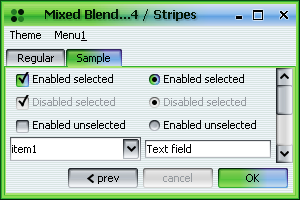
This example shows a mixed theme created from two blended themes, the first one a blend of Bottle Green and Lime Green and the second one a blend of Purple and Aqua:
new SubstanceMixBiTheme(new SubstanceBlendBiTheme(

              new SubstanceBottleGreenTheme(),

              new SubstanceLimeGreenTheme(), 0.6),

              new SubstanceBlendBiTheme(

                  new SubstancePurpleTheme(),

                  new SubstanceAquaTheme(), 0.4))
And the result is:
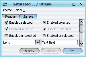
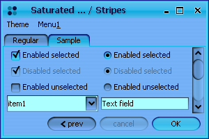
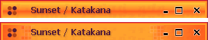
Saturated / desaturated themes
Important note - do not create instances of saturated themes directly using the constructor. Use the
public SubstanceTheme saturate(double saturateFactor)
method available in org.jvnet.substance.theme.SubstanceTheme
to create properly saturated themes (this is true especially for non-simple themes).
Here are examples of a regular (Aqua theme), the desaturated version
(by 50 percent) and the saturated version (by 50 percent). Note that all theme
paintings (including disabled controls) are saturated:
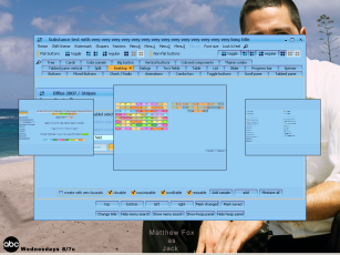
Complex themes
(user requested)
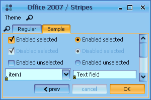
The frame above was created under the following theme:
ColorScheme shiftBlue = new ShiftColorScheme(

    new AquaColorScheme(), new Color(100, 150, 255),

    0.3);

SubstanceTheme activeTheme = new SubstanceSaturatedTheme(

    new SubstanceOrangeTheme(), 0.4);

SubstanceTheme defaultTheme = new SubstanceSaturatedTheme(

    new SubstanceTheme(shiftBlue, "Aqua Blue",

        ThemeKind.BRIGHT), -0.3);

SubstanceTheme disabledTheme = new SubstanceTintTheme(

    new SubstanceBlendBiTheme(new SubstanceAquaTheme(),

        new SubstanceSteelBlueTheme(), 0.8), 0.6);

SubstanceTheme activeTitleTheme = new SubstanceSaturatedTheme(

    defaultTheme, 0.2);

setTheme(new SubstanceComplexTheme("Office 2007",

    ThemeKind.BRIGHT, activeTheme, defaultTheme,

    disabledTheme, activeTitleTheme));
Additional sample complex themes implemented in org.jvnet.substance.theme.ComplexThemeFactory:
Prototype display value for combo popup
(user requested)
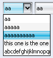
Example of a combo with Object prototype display value for popup:
    JComboBox comboProto1 = new JComboBox(new Object[] { "aa", "aaaaa",

        "aaaaaaaaaa", "this one is the one", "abcdefghijklmnopqrstuvwxyz" });

    comboProto1.setPrototypeDisplayValue("aaaaa");

    comboProto1.putClientProperty(

        SubstanceLookAndFeel.COMBO_POPUP_PROTOTYPE,

        "this one is the one");
And the result is (note that the last element is "cut off"):
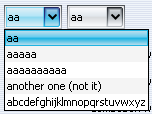
Example of a combo with widest-entry prototype display value for popup:
    JComboBox comboProto2 = new JComboBox(new Object[] { "aa", "aaaaa",

        "aaaaaaaaaa", "another one (not it)", "abcdefghijklmnopqrstuvwxyz" });

    comboProto2.setPrototypeDisplayValue("aaaaa");

    comboProto2.putClientProperty(

        SubstanceLookAndFeel.COMBO_POPUP_PROTOTYPE,

        new WidestComboPopupPrototype());
And the result is (note that the last element is "cut off"):
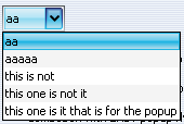
Example of a combo with custom computation of prototype display value for popup:
    JComboBox comboProto3 = new JComboBox(new Object[] { "aa", "aaaaa",

        "this is not", "this one is not it",

        "this one is it that is for the popup" });

    comboProto3.setPrototypeDisplayValue("aaaaa");

    comboProto3.putClientProperty(

        SubstanceLookAndFeel.COMBO_POPUP_PROTOTYPE,

        new ComboPopupPrototypeCallback() {

          public Object getPopupPrototypeDisplayValue(JComboBox jc) {

            return jc.getModel().getElementAt(

                jc.getModel().getSize() - 1);

          }

        });
And the result is (last element is selected as prototype):
Expanding per-component theme support
(user requested)
Animated tab icons
(user requested)
Example of a tab with the original icon and the same tab under three different animation kinds:
Additional title painter
(user requested)
- -Dsubstancelaf.titlePainter=org.jvnet.substance.title.RandomCubesTitlePainter
- SubstanceLookAndFeel.setCurrentTitlePainter("org.jvnet.substance.title.RandomCubesTitlePainter")
- SubstanceLookAndFeel.setCurrentTitlePainter(new RandomCubesTitlePainter())
Tab paging
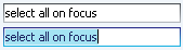
"Select all on focus" on text components
(user requested)
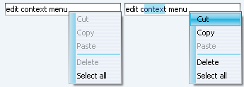
Edit context menu on text components
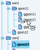
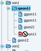
Drag-and-drop support on trees
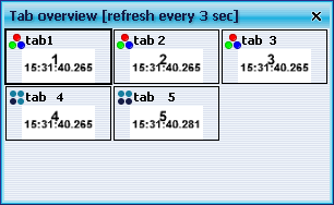
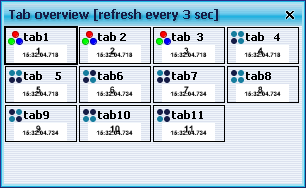
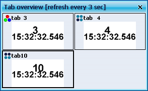
Tab overview dialog supports periodic refreshing
(user requested)
public boolean toUpdatePeriodically(JTabbedPane tabPane)

public int getUpdateCycle(JTabbedPane tabPane)
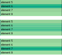
The default implementation of the first method return false (no periodic update). Custom implementation that wishes to periodically update the tab overview dialog should return true in the overriding implementation of the first method and the number of milliseconds between updates in the overriding implementation of the second method. Screenshots below show tab overview of a tabbed pane with 3 seconds period. The second screenshot shows the overview after some tabs have been added. The third screenshot shows the overview after some tabs have been deleted.
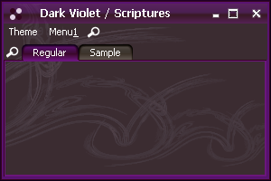
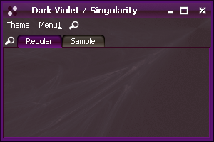
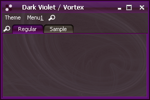
Fractal-based watermarks
Custom buttons on decorated title panes
(user requested)
public static void setRootPaneCustomTitleButtons(JRootPane rootPane,

      List<TitleButtonInfo> infoList)

public static void removeRootPaneCustomTitleButtons(JRootPane rootPane)
Sample usage of this API that creates custom buttons that open an option dialog when clicked and have theme-consistent icons is:
TitleButtonInfo tbInfo1 = new TitleButtonInfo();
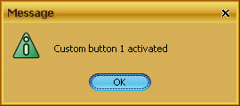
tbInfo1.setActionListener(new ActionListener() {
public void actionPerformed(ActionEvent e) {
JOptionPane.showMessageDialog(Check.this,
"Custom button 1 activated");
}
});
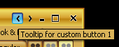
tbInfo1.setTooltipText("Tooltip for custom button 1");
tbInfo1.setButtonCallback(new TitleButtonCallback() {
public Icon getTitleButtonIcon(
SubstanceTheme currSubstanceTheme,
int iconMaxWidth, int iconMaxHeight) {
return new ImageIcon(SubstanceImageCreator
.overlayEcho(SubstanceImageCreator
.getArrow(9, 5,
SwingConstants.WEST,
currSubstanceTheme
.getColorScheme()),
1, 1));
}
});
TitleButtonInfo tbInfo2 = new TitleButtonInfo();
...
java.util.List<TitleButtonInfo> tbInfoList = new LinkedList<TitleButtonInfo>();
tbInfoList.add(tbInfo1);
tbInfoList.add(tbInfo2);
SubstanceLookAndFeel.setRootPaneCustomTitleButtons(
this.getRootPane(), tbInfoList);
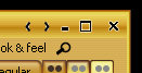
The title pane before calling the code above:
The title pane after calling the code above:
The tooltip on the first custom button:
The first custom button clicked:
Fade animations on lists
Note that as with other controls, setting the org.jvnet.lafwidget.LafWidget.ANIMATION_KIND client property on the list with one of the values of org.jvnet.lafwidget.utils.AnimationKind enum will change the fade animation speed.
Improved rendering of drag bumps on toolbars
Added drag bumps on split pane dividers
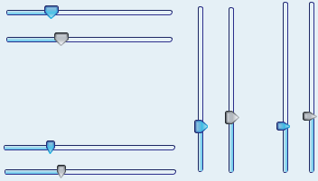
Improved painting of sliders
Configurable corner radius of toolbar buttons
(user requested)
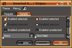
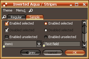
Improved painting of inverted themes