Image ghosting effects on buttons
Added configurable "image ghosting" effects on buttons. In order to enable image ghosting effects when the mouse enters a button with icon, call
 FadeConfigurationManager.getInstance().allowFades(

    FadeKind.GHOSTING_ICON_ROLLOVER);
In order to enable image ghosting effects when a button is pressed, call
 FadeConfigurationManager.getInstance().allowFades(

    FadeKind.GHOSTING_BUTTON_PRESS);
The Flash movie below illustrates both these effects (icon ghosting on rollover and button ghosting on press):
Tab pager enhancements
The tab pager widget has the following new functionality:
Ctrl+Mousescroll flips the tab preview windows (in addition toCtrl + RightArrow/Ctrl + LeftArrowcombinations).- Clicking a tab preview window closes the tab pager and selects the corresponding tab.
- Pressing
ESCAPEkey dismisses the tab pager.
Animation API
The loop animation is now can be initiated on undisplayable controls.
Here is an example of adding a label that repeatedly changes it foreground color from blue to black. Note that in version 2.0 the animation could only be initiated after the label has been made displayable.
    final JLabel instructional = new JLabel("Every odd row is editable");

    this.add(instructional, BorderLayout.NORTH);

    // create a looping animation to change the label foreground

    // from black to blue and back to draw some attention.

    FadeKind custom = new FadeKind("substance.testapp.table.instructional");

    FadeTracker.getInstance().trackFadeLooping(custom,

        AnimationKind.DEBUG_FAST, instructional, 0, false,

        new FadeTracker.FadeTrackerCallback() {

          public void fadeEnded(FadeKind fadeKind) {

          }


          public void fadePerformed(FadeKind fadeKind,

              float fadeCycle10) {

            instructional.setForeground(SubstanceColorUtilities

                .getInterpolatedColor(Color.black, Color.blue,

                    fadeCycle10 / 10.0));

          }

        }, true);
Component preview painter
The new LafWidget.COMPONENT_PREVIEW_PAINTER
client
property has been added. This property allows specifying the preview painter for a component.
This property can be set either on a component or globally on
UIManager. The value in both
cases should be an instance of
PreviewPainter. Default
implementation is available in the
DefaultPreviewPainter.
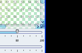
Scroll pane selector
New scroll pane selector widget (contributed by Pierre Le
Lannic) has been added to scroll panes. When the
LafWidget.COMPONENT_PREVIEW_PAINTER
client
property is installed on a scroll pane, a scroll pane selector button
is added to the bottom-right (LTR) or bottom-left (RTL)
corner of that scroll pane. Pressing the button pops up an overview
window which allows changing the viewport.
The screenshot below shows the bottom-right corner of a scroll pane. The mouse is over the scroll pane selector button:
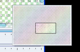
The screenshot below shows the scroll pane selector window itself (the scroll pane selector button has been pressed):
ESCAPE-select widget
The new LafWidget.TEXT_FLIP_SELECT_ON_ESCAPE
client
property has been added. This property is used to specify the selection flipping
on ESCAPE key press. This property can be set either
on a single combobox or globally on UIManager.
The value in both cases should be either
Boolean.TRUE or
Boolean.FALSE. By default,
this functionality is disabled.
When this functionality is enabled, if the
ESCAPE
key is pressed, the following happens:
- If selection is not empty, it is cleared.
- If selection is empty, the entire contents are selected.
API for configurating animation effects
The new org.jvnet.lafwidget.utils.FadeConfigurationManager
provides API for allowing and disallowing specific fade kinds.
  /**

   * Allows fade of the specified kind on all controls.

   *

   * @param fadeKind

   *            Fade kind to allow.

   */

  public synchronized void allowFades(FadeKind fadeKind)


  /**

   * Allows fade of the specified kind on all controls of specified class.

   *

   * @param fadeKind

   *            Fade kind to allow.

   * @param clazz

   *            Control class for allowing the fade kind.

   */

  public synchronized void allowFades(FadeKind fadeKind, Class clazz)


  /**

   * Allows fade of the specified kind on all controls of specified classes.

   *

   * @param fadeKind

   *            Fade kind to allow.

   * @param clazz

   *            Control classes for allowing the fade kind.

   */

  public synchronized void allowFades(FadeKind fadeKind, Class[] clazz)


  /**

   * Disallows fade of the specified kind on all controls.

   *

   * @param fadeKind

   *            Fade kind to disallow.

   */

  public synchronized void disallowFades(FadeKind fadeKind)


  /**

   * Disallows fade of the specified kind on all controls of specified class.

   *

   * @param fadeKind

   *            Fade kind to disallow.

   * @param clazz

   *            Control class for disallowing the fade kind.

   */

  public synchronized void disallowFades(FadeKind fadeKind, Class clazz)


  /**

   * Disallows fade of the specified kind on all controls of specified

   * classes.

   *

   * @param fadeKind

   *            Fade kind to disallow.

   * @param clazz

   *            Control classes for disallowing the fade kind.

   */

  public synchronized void disallowFades(FadeKind fadeKind, Class[] clazz)
Combobox auto-completion
The new LafWidget.COMBO_BOX_NO_AUTOCOMPLETION
client
property has been added. This property is used to specify that the
editable combobox has no auto completion. This property can be set either
on a single combobox or globally on UIManager.
The value in both cases should be either
Boolean.TRUE or
Boolean.FALSE. By default,
all editable comboboxes have auto-completion.