Decoration painters
The old title / header painters have been refactored to the new decoration painters. The documentation provides more information about the decoration painters.
The new SubstanceLookAndFeel.setDecorationType API can be used in the application code to mark specific visual area to be decoration areas. This functionality is also used internally in Substance to mark core and third-party components (such as toolbars, menu bars, SwingX's task pane container and status bar, Flamingo's ribbon and breadcrumb bar).
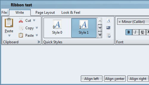
Here is a screenshot of the ribbon component under release 4.2 of Substance:
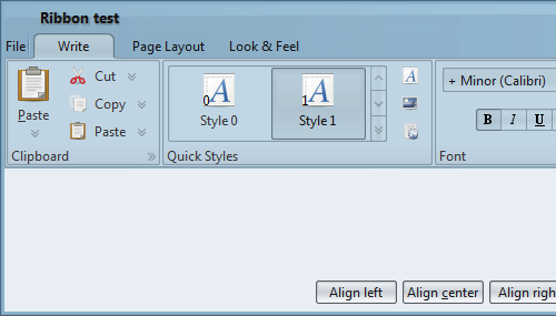
And here is the same component under release 4.3. Note how the tab area blends into the decorated title pane, and how the ribbon tasks are skinned in a different theme, making the entire ribbon component appear as a separate part of the bigger UI:
Menu layout
Much better layout of menus and menu items, providing full support for:
- Aligning icons, checkmark icons, texts, accelerator texts and arrow icons
- Right-to-left orientation
- High resolution monitors
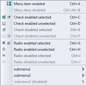
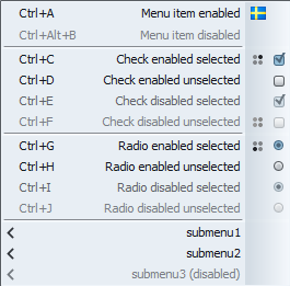
Here is a screenshot of a sample menu under the default font policy and left-to-right orientation. Note how all the icons and texts are properly spaced and aligned:
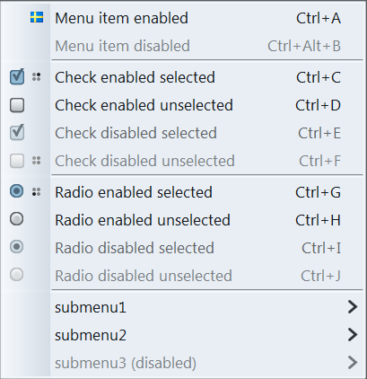
The same menu, this time with right-to-left orientation. Note how all the icons and texts are properly spaced, aligned and oriented:
The same menu with custom font policy (using bigger fonts). Note how all the icons and text are properly scaled, spaced and aligned, and how the gaps between adjacent menu visuals (icons, texts) are scaled:
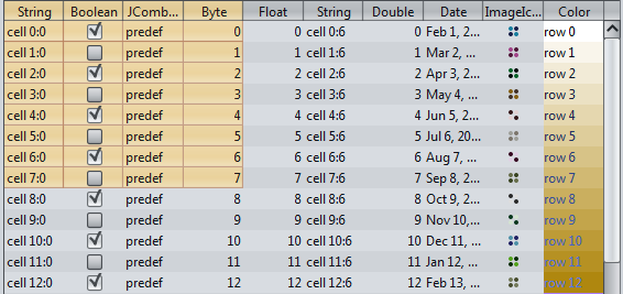
Highlight painters
The existing functionality of highlighting items / cells in menus, tables, trees and lists has been refactored to the new highlight painters. The documentation provides more information about the highlight painters.
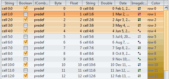
The screenshot below shows a sample table with four selected rows under Business Black Steel skin in Substance 4.2. Note that there are no border lines on the selected rows:
And here is the same table under Business Black Steel skin in Substance 4.3. Note the single-pixel separator lines on the selected rows:
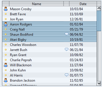
The screenshot below shows a sample table with a cluster of selected cells under Business skin. Note the single-pixel separator lines around the selected cells:
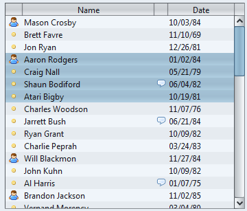
The screenshot below shows the same table with a cluster of selected rows under Office 2007 Silver skin. Note the single-pixel separator lines around the selected cells and the correct painting of highlights and separator lines on rollover selected second row:
Auto-scroll on scroll panes
The new
LafWidget.AUTO_SCROLL
client property can be installed on a specific scroll pane or globally
on the UIManager. Once it is set to
Boolean.TRUE, the corresponding
scroll pane(s) will have the auto-scroll mode installed on them. There are
two operation modes:
- Press the middle mouse button and release it. The scroll pane is transferred into the auto-scroll mode. It can be dismissed by clicking the mouse or scrolling the mouse wheel.
- Press the middle mouse button and start dragging. The auto-scroll is dismissed by releasing the middle mouse button.
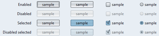
Visuals for disabled selected buttons
Buttons in disabled selected state now use a custom theme that blends the colors of themes for disabled and selected states. A skin can override this setting to use its own theme computation.
The screenshot below shows buttons in different states. The last row shows disabled selected buttons. Note how the colors of disabled and selected states are blended together to provide consistent and identifiable appearance of these buttons:
Usability of tab close buttons
The tab close buttons (enabled by the SubstanceLookAndFeel.TABBED_PANE_CLOSE_BUTTONS_PROPERTY client property) have improved usability.
- The tab close callback is called on mouse release and not on mouse press.
- When the mouse is pressed over a tab close button, this tab is not automatically selected.
- The tab close callback checks that the mouse release happened on the close button of the same tab as mouse press.
First support for very large fonts
Previous release have introduced support for high-resolution monitors (high DPI) by scaling all visuals and metrics based on the control font size. This release has started work on supporting very large fonts which is oriented towards point of sale (POS) systems.
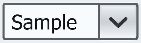
Here is a screenshot of an editable combobox using 72 pixel font under Substance 4.2. Note the clipped text, the gray margin around the text field editor and cap / join of the arrow icon:
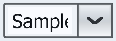
And here is the same editable combobox under Substance 4.3:
Here is a screenshot of an icon button using 72 pixel font under Substance 4.2. Note the icon text gap, focus ring touching the text and the corners radius:
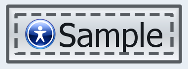
And here is the same button under Substance 4.3:
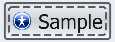
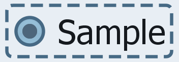
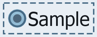
Here is a screenshot of a radio button using 72 pixel font under Substance 4.2. Note the checkmark text gap, focus ring weight, focus ring corner radius and the outer edge of the checkmark:
And here is the same radio button under Substance 4.3: