A skin is a set of visual settings that gives your application a polished and consistent look. The core Substance library bundles a number of predefined skins that can be broadly categorized as light and dark.
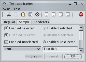
Light skins use predominantly light colors for painting the UI controls and containers. Business skin is an example of a light skin:
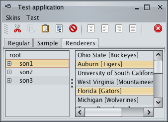
Dark skins use predominantly dark colors for painting the UI controls and containers. Graphite Glass skin is an example of a dark skin:
The core Substance skins are in the org.pushingpixels.substance.api.skin
package, and the
org.pushingpixels.substance.api.SubstanceSkin
class contains all the APIs officially supported by Substance skins. It is possible to use different Substance
skins on different windows in the same application. Consult the documentation on the
SubstanceLookAndFeel.SKIN_PROPERTY client
property.
The skin definition consists of the following:
In order to define a valid skin, you need to specify all its mandatory
parameters. A valid skin must have a color scheme bundle for
DecorationAreaType.NONE,
button shaper, fill painter, decoration painter,
highlight painter and border painter. All other parts are optional.
The documentation on decoration
painters explains the notion of a decoration area type. While a valid skin
must define a color scheme bundle for
DecorationAreaType.NONE, all other
decoration area types are optional. Different skins have different sets of
decoration areas that are painted. For example, the core Moderate skin decorates
only DecorationAreaType.PRIMARY_TITLE_PANE and
DecorationAreaType.SECONDARY_TITLE_PANE,
while the core BusinessBlueSteel decorates additional
DecorationAreaType.HEADER,
DecorationAreaType.TOOLBAR,
DecorationAreaType.FOOTER and
DecorationAreaType.GENERAL:
In order to register a custom color scheme bundle and an optional background color scheme on the specific decoration area type(s), use the following APIs:
  /**

   * Registers the specified color scheme bundle to be used on controls in

   * decoration areas.

   *

   * @param bundle

   *     The color scheme bundle to use on controls in decoration areas.

   * @param areaTypes

   *     Enumerates the area types that are affected by the parameters.

   */

  public void registerDecorationAreaSchemeBundle(

      SubstanceColorSchemeBundle bundle, DecorationAreaType... areaTypes)


  /**

   * Registers the specified color scheme bundle and background color scheme

   * to be used on controls in decoration areas.

   *

   * @param bundle

   *     The color scheme bundle to use on controls in decoration areas.

   * @param backgroundColorScheme

   *     The color scheme to use for background of controls in decoration

   *     areas.

   * @param areaTypes

   *     Enumerates the area types that are affected by the parameters.

   */

  public void registerDecorationAreaSchemeBundle(

      SubstanceColorSchemeBundle bundle,

      SubstanceColorScheme backgroundColorScheme,

      DecorationAreaType... areaTypes)
Decoration areas registered with these APIs will have their background painted by the skin's decoration painter based on the default color scheme of the registered color scheme bundle. You can also use the following API to use a custom default color scheme on the specified decoration area types (in this case the controls in those decoration areas will use the default color scheme bundle):
  /**

   * Registers the specified background color scheme to be used on controls in

   * decoration areas.

   *

   * @param backgroundColorScheme

   *     The color scheme to use for background of controls in decoration

   *     areas.

   * @param areaTypes

   *     Enumerates the area types that are affected by the parameters. Each

   *     decoration area type will be painted by {@link

   *     SubstanceDecorationPainter#paintDecorationArea(Graphics2D,

   *     Component, DecorationAreaType, int, int, SubstanceSkin)}.

   */

  public void registerAsDecorationArea(

      SubstanceColorScheme backgroundColorScheme,

      DecorationAreaType... areaTypes)
Here is an example of specifying the default color scheme bundle for the core Business Blue Steel skin:
    SubstanceColorScheme activeScheme = new SteelBlueColorScheme().tint(

        0.15).named("Business Blue Steel Active");

    SubstanceColorScheme enabledScheme = new MetallicColorScheme().tint(

        0.05).named("Business Blue Steel Enabled");

    SubstanceColorScheme disabledScheme = new LightGrayColorScheme().tint(

        0.05).named("Business Blue Steel Disabled");


    SubstanceColorSchemeBundle defaultSchemeBundle = new SubstanceColorSchemeBundle(

        activeScheme, enabledScheme, disabledScheme);


    SubstanceSkin.ColorSchemes kitchenSinkSchemes = SubstanceSkin

        .getColorSchemes("org/pushingpixels/substance/api/skin/kitchen-sink.colorschemes");

    SubstanceColorScheme highlightColorScheme = kitchenSinkSchemes

        .get("Business Blue Steel Highlight");

    defaultSchemeBundle.registerHighlightColorScheme(highlightColorScheme);

    this.registerDecorationAreaSchemeBundle(defaultSchemeBundle,

        DecorationAreaType.NONE);
and a custom color scheme bundle for the header-type decoration areas:
    SubstanceColorScheme activeHeaderScheme = activeScheme.saturate(0.2)

        .named("Business Blue Steel Active Header");

    SubstanceColorScheme enabledHeaderScheme = activeScheme.saturate(-0.2)

        .named("Business Blue Steel Enabled Header");

    SubstanceColorSchemeBundle headerSchemeBundle = new SubstanceColorSchemeBundle(

        activeHeaderScheme, enabledHeaderScheme, enabledHeaderScheme);

    headerSchemeBundle.registerColorScheme(enabledHeaderScheme, 0.5f,

        ComponentState.DISABLED_UNSELECTED,

        ComponentState.DISABLED_SELECTED);

    this.registerDecorationAreaSchemeBundle(headerSchemeBundle,

        DecorationAreaType.PRIMARY_TITLE_PANE,

        DecorationAreaType.SECONDARY_TITLE_PANE,

        DecorationAreaType.HEADER, DecorationAreaType.TOOLBAR);
And here is an example of specifying a number of decoration area types to have their background painted by the decoration painter and the specific color scheme, without registering a custom color scheme bundle for those areas:
    this.registerAsDecorationArea(defaultScheme,

        DecorationAreaType.PRIMARY_TITLE_PANE,

        DecorationAreaType.SECONDARY_TITLE_PANE,

        DecorationAreaType.HEADER, DecorationAreaType.FOOTER,

        DecorationAreaType.GENERAL);
To add polishing touches to the specific decoration areas, use overlay painters with the following API:
  /**

   * Adds the specified overlay painter to the end of the list of overlay

   * painters associated with the specified decoration area types.

   *

   * @param overlayPainter

   *            Overlay painter to add to the end of the list of overlay

   *            painters associated with the specified decoration area types.

   * @param areaTypes

   *            Decoration area types.

   */

  public void addOverlayPainter(SubstanceOverlayPainter overlayPainter,

      DecorationAreaType... areaTypes)
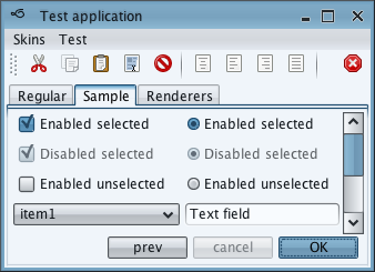
Here is how the core Nebula skin is configured to paint drop shadows on the toolbars and separators on title panes and headers:
    // add an overlay painter to paint a drop shadow along the top

    // edge of toolbars

    this.addOverlayPainter(TopShadowOverlayPainter.getInstance(),

        DecorationAreaType.TOOLBAR);


    // add an overlay painter to paint separator lines along the bottom

    // edges of title panes and menu bars

    this.bottomLineOverlayPainter = new BottomLineOverlayPainter(

        new ColorSchemeSingleColorQuery() {

          @Override

          public Color query(SubstanceColorScheme scheme) {

            Color dark = scheme.getDarkColor();

            return new Color(dark.getRed(), dark.getGreen(), dark

                .getBlue(), 160);

          }

        });

    this.addOverlayPainter(this.bottomLineOverlayPainter,

        DecorationAreaType.PRIMARY_TITLE_PANE,

        DecorationAreaType.SECONDARY_TITLE_PANE,

        DecorationAreaType.HEADER);
and here is how it looks like:
You can use the following APIs to configure the start and end values for the selected tab fade:
  /**

   * Sets the start of fade effect on the selected tabs in {@link JTabbedPane}

   * s. The value should be in 0.0-1.0 range.

   *

   * @param selectedTabFadeStart

   *     The start of fade effect on the selected tabs in {@link JTabbedPane}

   *     s. Should be in 0.0-1.0 range.

   */

  public void setSelectedTabFadeStart(double selectedTabFadeStart)


  /**

   * Sets the end of fade effect on the selected tabs in {@link JTabbedPane}s.

   * The value should be in 0.0-1.0 range.

   *

   * @param selectedTabFadeEnd

   *     The end of fade effect on the selected tabs in {@link JTabbedPane}s.

   *     Should be in 0.0-1.0 range.

   */

  public void setSelectedTabFadeEnd(double selectedTabFadeEnd)
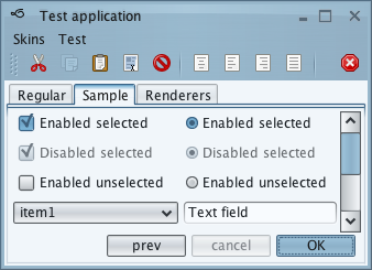
By default, the fade start is at 0.1 and the fade end is at 0.3 - here is how it looks like on the core Sahara skin:
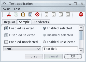
Here is how these APIs are used in the core Creme skin to specify a slightly larger selected tab fade:
    this.setSelectedTabFadeStart(0.2);

    this.setSelectedTabFadeEnd(0.4);
and this is how it looks like:
All the other settings (watermark, painters, watermark color scheme) are set in the skin constructor. Here is sample code from the core Office Silver 2007 skin:
    this.buttonShaper = new ClassicButtonShaper();

    this.watermark = null;


    this.fillPainter = new FractionBasedFillPainter("Office Silver 2007",

        new float[] { 0.0f, 0.49999f, 0.5f, 1.0f },

        new ColorSchemeSingleColorQuery[] {

            ColorSchemeSingleColorQuery.ULTRALIGHT,

            ColorSchemeSingleColorQuery.LIGHT,

            ColorSchemeSingleColorQuery.ULTRADARK,

            ColorSchemeSingleColorQuery.EXTRALIGHT });


    FractionBasedBorderPainter outerBorderPainter = new FractionBasedBorderPainter(

        "Office Silver 2007 Outer", new float[] { 0.0f, 0.5f, 1.0f },

        new ColorSchemeSingleColorQuery[] {

            ColorSchemeSingleColorQuery.LIGHT,

            ColorSchemeSingleColorQuery.ULTRADARK,

            ColorSchemeSingleColorQuery.MID });

    SubstanceBorderPainter innerBorderPainter = new DelegateFractionBasedBorderPainter(

        "Office Silver 2007 Inner", outerBorderPainter, new int[] {

            0xFFFFFFFF, 0xFFFFFFFF, 0xFFFFFFFF },

        new ColorSchemeTransform() {

          @Override

          public SubstanceColorScheme transform(

              SubstanceColorScheme scheme) {

            return scheme.tint(0.8f);

          }

        });

    this.borderPainter = new CompositeBorderPainter("Office Silver 2007",

        outerBorderPainter, innerBorderPainter);


    this.decorationPainter = new FractionBasedDecorationPainter(

        "Office Blue 2007", new float[] { 0.0f, 0.2499999f, 0.25f,

            0.3f, 0.7f, 1.0f }, new ColorSchemeSingleColorQuery[] {

            ColorSchemeSingleColorQuery.ULTRALIGHT,

            ColorSchemeSingleColorQuery.EXTRALIGHT,

            ColorSchemeSingleColorQuery.DARK,

            ColorSchemeSingleColorQuery.MID,

            ColorSchemeSingleColorQuery.LIGHT,

            ColorSchemeSingleColorQuery.ULTRALIGHT });


    this.highlightPainter = new ClassicHighlightPainter();
public static Map<String, SkinInfo> getAllSkins()
 Returns all available skins.
public static boolean setSkin(String skinClassName)
Sets the specified skin.
public static boolean setSkin(SubstanceSkin skin)
Sets the specified skin.
public static SubstanceSkin getCurrentSkin(Component c)
Returns the current skin for the specified component.
public static void registerSkinChangeListener(

      SkinChangeListener skinChangeListener)
Registers a new listener on skin change.
public static void unregisterSkinChangeListener(

      SkinChangeListener skinChangeListener)
Unregisters a listener on skin change.
SubstanceLookAndFeel.SKIN_PROPERTY
Property name for specifying skin to be used on the specific root pane.
As with color scheme bundles, it is possible to create a derived skin. The same warning applies - a skin is a delicate collection of different color scheme bundles, painters and additional settings carefully chosen to work together in providing visually appealing appearance and consistent animation sequences. In some cases, creating a derived skin will result in poor visuals.
You can use the following API to create a derived skin:
  /**

   * Creates a new skin that has the same settings as this skin with the

   * addition of applying the specified color scheme transformation on all the

   * relevant color schemes

   *

   * @param transform

   *     Color scheme transformation.

   * @param name

   *     The name of the new skin.

   * @return The new skin.

   */

  @SubstanceApi

  public SubstanceSkin transform(ColorSchemeTransform transform,

      final String name)
Where the color scheme transformation is defined by the following interface:
/**

 * Defines transformation on a color scheme.

 *

 * @author Kirill Grouchnikov

 */

public interface ColorSchemeTransform {

  /**

   * Transforms the specified color scheme.

   *

   * @param scheme

   *            The original color scheme to transform.

   * @return The transformed color scheme.

   */

  public SubstanceColorScheme transform(SubstanceColorScheme scheme);

}
Substance provides an option for specifying custom skin. This option
uses the Substance plugin mechanism to discover additional
skins at runtime. As with all Substance plugins, you must pack an
additional XML configuration file in one of your runtime jarfiles. The name
of this file must be
META-INF/substance-plugin.xml
and it must comply with the following syntax:
<laf-plugin>
   additional optional tags
   <skin-plugin-class>...</skin-plugin-class>
   additional optional tags
</laf-plugin>
The contents of skin-plugin-class
tag must be the fully-qualified class name of a class that implements the
SubstanceSkinPlugin interface.
This interface specifies the following methods:
  /**

   * Returns information on all available skins in <code>this</code> plugin.

   *

   * @return Information on all available skins in <code>this</code> plugin.

   */

  public Set<SkinInfo> getSkins();


  /**

   * Returns the class name of the default skin.

   *

   * @return The class name of the default skin.

   */

  public String getDefaultSkinClassName();
The SkinInfo class
contains information on single (base or custom) skin.
Note that using this option you may override the skins supplied with Substance base package (by specifying the same display name). This behaviour, however, is not guaranteed to be consistent across various VMs and class loaders, since the skin plugins are processed in random order.
The following class implements a custom combobox that lists all available Substance skins and allows changing the current Substance skin based on the user selection.
public class SubstanceSkinComboSelector extends JComboBox {

  public SubstanceSkinComboSelector() {

    // populate the combobox

    super(new ArrayList<SkinInfo>(SubstanceLookAndFeel.getAllSkins()

        .values()).toArray());

    // set the current skin as the selected item

    SubstanceSkin currentSkin = SubstanceLookAndFeel.getCurrentSkin();

    for (SkinInfo skinInfo : SubstanceLookAndFeel.getAllSkins().values()) {

      if (skinInfo.getDisplayName().compareTo(

          currentSkin.getDisplayName()) == 0) {

        this.setSelectedItem(skinInfo);

        break;

      }

    }

    // set custom renderer to show the skin display name

    this.setRenderer(new SubstanceDefaultComboBoxRenderer(this) {

      @Override

      public Component getListCellRendererComponent(JList list,

          Object value, int index, boolean isSelected,

          boolean cellHasFocus) {

        return super.getListCellRendererComponent(list,

            ((SkinInfo) value).getDisplayName(), index, isSelected,

            cellHasFocus);

      }

    });

    // add an action listener to change skin based on user selection

    this.addActionListener(new ActionListener() {

      @Override

      public void actionPerformed(ActionEvent e) {

        SwingUtilities.invokeLater(new Runnable() {

          @Override

          public void run() {

            SubstanceLookAndFeel

                .setSkin(((SkinInfo) SubstanceSkinComboSelector.this

                    .getSelectedItem()).getClassName());

          }

        });

      }

    });

  }

}
getAllSkins() API to populate the
combobox with the list of all available Substance skins.getCurrentSkin() API to
select the combobox entry that matches the current Substance skin.SkinInfo
objects, we extend the default Substance combobox cell renderer to use the display name of the skin.setSkin(String className)
API to set the selected skin as the new global Substance skin. Note that there is no need to
explicitly invoke SwingUtilities.updateComponentTree
on all your windows after calling this Substance API.The same approach can be used to create a menu selection of available Substance skins.